{picture one}
{picture two}
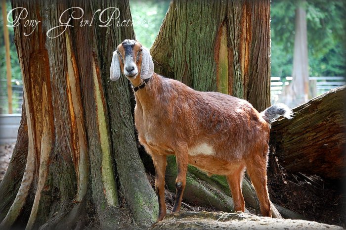
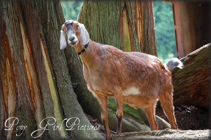
There are slight differences in expression on the goat's face, and the layout of the trees. I could not decide which photo I liked better! I love the slightly tilted head of the goat in picture one. But I liked seeing less of the cedar tree and more of the green background in picture two. This was shot late afternoon, when the sun was lowering behind trees, so it was very shady where I took this from.
Which one do you like? Do you take more than one shot of an animal or scene, and notice the subtle differences?
Remember, this is Walter, my favorite goat. He is hanging out in his "jungle gym" of old stumps and trees. Walter is old, and probably has arthritis. His front leg looks a bit crooked and it is. He's a bit of a gimp.
A pretty photogenic gimp, nonetheless.
Next time, I'll have a few more from this particular series and want to talk about light.


9 comments:
Cute! I think I like the first one best. I like the way Walter's red relates more to the red in the trees, and I like his tilted head.
What awesome looking trees, too!
I like the first one better.
I like the first shot. As if he is saying, with that tilted head "Well, hello there human photographer lady." LOL!
Gotta love those goats!
Like the others I like the look on his face in the first one the best. You have such a beautiful area to be photographing in.
It's my goat, Walter! He is getting up there in age. Poor guy.
I like them both, but I like his cocked head in the first one!
I like the first one!!! Love how the colors just pop!!
i think i like the first one too! i think the b/g is less busy because you CANT see the greenery on the sides. plus i like the slightly tighter crop and how it makes him appear just a little bit closer/bigger.
you are doing an amazing job!
I like the second shot more. I like it that there is "more" background, it has a slightly softer tone, bit more color and more atmoshpere.
With a portrait (a headshot or if you want the animal or object to be the only center of attention) it is nicer if the background is blurry and the "star" is shining without "things around" distracting.
Your picture is a portrait of this pretty goat in that very moment, where the light is perfect, she is standing next to those massive, beautiful trees and that makes that setting special.
Good work!
Post a Comment